library(tidyverse)

# You may need to change the file path (this one is for macs)
mortgage <- read_csv("~/Downloads/county_06065.csv") %>%
  filter(
    business_or_commercial_purpose == 2,
    total_units == 1,
    derived_dwelling_category == "Single Family (1-4 Units):Site-Built",
    action_taken %in% c(1, 2, 3),
    income >= 0,
    income <= 800
  ) %>%
  mutate(
    approved = if_else(action_taken %in% c(1, 2), 1, 0),

    loan_purpose = case_when(
      loan_purpose == 1  ~ "Home purchase",
      loan_purpose == 2  ~ "Home improvement",
      loan_purpose == 31 ~ "Refinance",
      loan_purpose == 32 ~ "Cash-out refinance",
      loan_purpose == 4  ~ "Other",
      .default = NA_character_
    ),

    derived_ethnicity = case_when(
      derived_ethnicity == "Hispanic or Latino"     ~ "Hispanic",
      derived_ethnicity == "Not Hispanic or Latino" ~ "Not Hispanic",
      derived_ethnicity == "Joint"                  ~ "Joint",
      .default = NA_character_
    ),

    derived_sex = na_if(derived_sex, "Sex Not Available"),

    derived_race = case_when(
      derived_race == "White"                      ~ "White",
      derived_race == "Black or African American" ~ "Black",
      derived_race == "Asian"                     ~ "Asian",
      derived_race == "Joint"                     ~ "Joint",
      derived_race %in% c(
        "American Indian or Alaska Native",
        "Native Hawaiian or Other Pacific Islander",
        "2 or more minority races"
      ) ~ "Other",
      .default = NA_character_
    ),

    applicant_age = na_if(applicant_age, "8888"),

    debt_to_income_ratio = case_when(
      debt_to_income_ratio == "<20%" ~ "15",
      debt_to_income_ratio == "20%-<30%" ~ "25",
      debt_to_income_ratio == "30%-<36%" ~ "33",
      debt_to_income_ratio == "50%-60%" ~ "55",
      debt_to_income_ratio == ">60%" ~ "65",
      debt_to_income_ratio %in% as.character(36:49) ~ debt_to_income_ratio,
      .default = NA_character_
    ),

    loan_type = case_when(
      loan_type == 1 ~ "Conventional",
      loan_type == 2 ~ "FHA",
      loan_type == 3 ~ "VA",
      loan_type == 4 ~ "USDA/FSA",
      .default = NA_character_
    ),

    lien_status = case_when(
      lien_status == 1 ~ "First lien",
      lien_status == 2 ~ "Subordinate lien",
      .default = NA_character_
    ),

    occupancy_type = case_when(
      occupancy_type == 1 ~ "Principal residence",
      occupancy_type == 2 ~ "Second residence",
      occupancy_type == 3 ~ "Investment property",
      .default = NA_character_
    ),

    loan_amount = loan_amount / 1000,
    property_value = as.numeric(property_value) / 1000,
    debt_to_income_ratio = as.numeric(debt_to_income_ratio),
    loan_term = as.numeric(loan_term),
    interest_rate = as.numeric(interest_rate),

    loan_purpose = factor(loan_purpose),
    derived_ethnicity = factor(derived_ethnicity),
    derived_race = factor(derived_race),
    derived_sex = factor(derived_sex),
    applicant_age = factor(
      applicant_age,
      levels = c("<25", "25-34", "35-44", "45-54", "55-64", "65-74", ">74")
    ),
    conforming_loan_limit = factor(conforming_loan_limit),
    loan_type = factor(loan_type),
    lien_status = factor(lien_status),
    occupancy_type = factor(occupancy_type)
  ) %>%
  select(
    approved,
    income,
    debt_to_income_ratio,
    race = derived_race,
    ethnicity = derived_ethnicity,
    sex = derived_sex,
    age = applicant_age,
    loan_amount,
    loan_type,
    loan_purpose,
    lien_status,
    conforming_loan_limit,
    property_value,
    occupancy_type
  ) %>%
  mutate(
    race = fct_relevel(race, "White"),
    ethnicity = fct_relevel(ethnicity, "Not Hispanic"),
    sex = fct_relevel(sex, "Joint"),
    age = fct_relevel(age, "35-44"),
    loan_type = fct_relevel(loan_type, "Conventional"),
    loan_purpose = fct_relevel(loan_purpose, "Home purchase"),
    lien_status = fct_relevel(lien_status, "First lien"),
    conforming_loan_limit = fct_relevel(conforming_loan_limit, "C"),
    occupancy_type = fct_relevel(occupancy_type, "Principal residence")
)8 ROC Curves/Thresholds
We’ve been studying two models for predicting mortgage approval:
- a linear probability model (LPM)
- a logistic regression model (logit)
Last class, we turned predicted probabilities into approval decisions by choosing a threshold. But a threshold of 0.7 is just one possible choice. If we change the threshold, the model will approve more or fewer applicants, and that changes the kinds of mistakes it makes.
In this classwork, we’ll look at model performance across all possible thresholds using the ROC curve. ROC stands for Receiver Operating Characteristic. The name comes from signal detection theory, where it was originally used during World War II to evaluate how well radar operators (the “receivers”) could distinguish real signals (enemy aircraft) from noise.
The ROC curve plots:
- the False Positive Rate (FPR) on the x-axis
- the True Positive Rate (TPR) on the y-axis
Use these formulas:
- \(\mathrm{FPR} = \frac{FP}{FP + TN}\): out of all the bad applicants, how many do we mistakenly approve?
- \(\mathrm{TPR} = \frac{TP}{TP + FN}\): out of all the good applicants, how many do we successfully approve?
A good classifier has a high TPR and a low FPR, so we prefer ROC curves that stay closer to the upper-left corner of the graph.
Part 1: Add predicted probabilities
Fit an LPM and then add predicted probabilities to the data set.
lpm <- ___

mortgage <- mortgage %>%
  mutate(
    lpm_prediction = predict(___),
  ) %>%
  select(approved, lpm_prediction, everything())
Part 2: Build confusion()
A classifier depends on the threshold we choose. In the function below, fill in the blanks so that it computes the confusion matrix outcomes and rates for any threshold.
confusion <- function(threshold, prediction_var) {
  mortgage %>%
    mutate(
      classifier = if_else({{ prediction_var }} >= threshold, 1, 0)
    ) %>%
    drop_na(classifier) %>%
    summarise(
      TP = sum(approved == ___ & classifier == ___),
      TN = sum(approved == ___ & classifier == ___),
      FP = sum(approved == ___ & classifier == ___),
      FN = sum(approved == ___ & classifier == ___)
    ) %>%
    mutate(
      TPR = TP / (TP + ___),
      FPR = FP / (FP + ___),
      accuracy = (___ + ___) / (TP + TN + FN + FP),
      threshold = threshold
    ) %>%
    select(threshold, TPR, FPR, accuracy, threshold)
}
Test to make sure your function works:
confusion(
  threshold = 0.7,
  prediction_var = lpm_prediction
  )
To create the ROC, we’ll let the threshold vary from 0 to 1 and plot the False Positive Rate (FPR) on the x-axis and the True Positive Rate (TPR) on the y-axis. This is the plan for part 3.
Part 3: map()
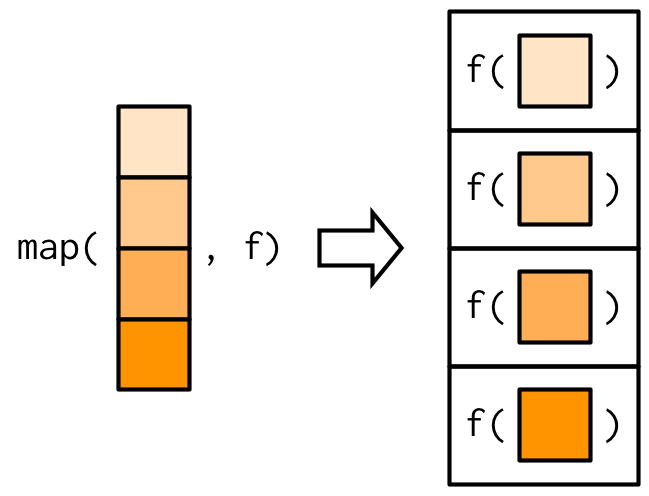
Let’s use the tidyverse’s map() to let the threshold vary. Here’s what map() does:
- map() takes two arguments:
.x(a vector or list) and.f(a function) - map() applies
.fto every element of.x, and returns those outputs. - In this way, map() creates a mapping between inputs .x and outputs by way of the function
.f.
Here’s a diagram:
And here’s an example:
# inputs .x: a list of 3 vectors.
# function .f: mean
# map() will apply .f to every element of .x (each of the 3 vectors)
# map() will return the mean of all three vectors.

map(
  .x = list(0:10, 0:20, 0:30),
  .f = mean
)
Here’s another example using a formula as a .f (start a formula with the tilde ~, then refer directly to .x). This .f subtracts by 3:
# inputs .x: a list of 3 vectors.
# function .f: ~ .x - 3
# subtracts 3 from every element of .x

map(
  .x = list(0:10, 0:20, 0:30),
  .f = ~ .x - 3
)
Now use map() to call confusion() on 100 numbers between 0 and 1. What should your .x be? What should your .f be?
lpm_roc <- map(
  .x = ___,
  .f = ___
) %>%
  bind_rows()

view(lpm_roc)
Pipe your map() results into bind_rows() to bind everything into a results tibble. Then interpret your results:
- As the threshold rises, the TPR (how many of the good applicants we’re able to approve) starts at ___ and then ___.
- As the threshold rises, the FPR (how many of the bad applicants we mistakenly approve) starts at ___ and then ___.
- As the threshold rises, accuracy (rises/falls), reaches a (minimum/maximum), and then (rises/falls). This represents the tradeoff between TPR and FPR: raise the threshold and you exclude more of the bad applicants, but you also exclude more of the good ones.
Part 4: Plot the ROC
Take lpm_roc and visualize the ROC curve. Use labs(title = "LPM ROC Curve") to add a title to the plot.
lpm_roc %>%
  ___ +
  ___ +
  labs(title = "LPM ROC Curve")
A good classifier has a high TPR and a low FPR, so we want classifiers that stay as close as possible to the upper left corner here.
Imagine the perfect classifier, which is able to achieve FPR = 0 and TPR = 1. The ROC curve is a right angle. For that classifier, the Area Under the Curve (AUC) would be 1. So AUC is a metric that summarizes the ROC curve, where higher values for the AUC is generally better.
Part 5: Calculate the AUC
We’ll use the trapezoid rule to find the area under the curve:
- Sort the ROC points from left to right by FPR.
- Between each pair of adjacent points, compute the area of the trapezoid: \(area = (width) \times \frac{height_1 + height_2}{2}\)
- Add them up.
lpm_roc %>%
  ___(FPR) %>%
  ___(
    next_FPR = lead(FPR),
    next_TPR = lead(TPR),
    trapezoid_area = (___) * .5 * (___)
  ) %>%
  summarize(AUC = sum(trapezoid_area, na.rm = T))
Part 6: Repeat the analysis for the logit
- Add predicted probabilities to
mortgage - Use
map()to find logit_roc - Plot the logit ROC curve on the same plot as the LPM ROC curve
- Find the logit AUC
logit <- ___

mortgage <- mortgage %>%
  mutate(
    logit_prediction = ___,
  ) %>%
  select(approved, logit_prediction, everything())

view(mortgage)

logit_roc <- map(
  .x = ___,
  .f = ___
) %>%
  bind_rows()

ggplot() +
  geom_line(data = ___, aes(x = ___, y = ___), color = ___) +
  geom_line(data = ___, aes(x = ___, y = ___), color = ___) +
  labs(title = "Logit vs LPM ROC Curve")

logit_roc %>%
  ___(FPR) %>%
  ___(
    next_FPR = lead(FPR),
    next_TPR = lead(TPR),
    trapezoid_area = (___) * .5 * (___)
  ) %>%
  summarize(AUC = sum(trapezoid_area, na.rm = T))
What do you find?
Download this assignment
Here’s a link to download this assignment.